People often ask me how to visualize information. They ask things like “How can I visualize my industry ecosystem?” or “How can I visualize how my product works?” My first instinct is to try and back them up a bit. This is because they are already defining their project in terms of an answer or solution, and before you can deliver an answer you need to know the question. Getting the question right is the most important component in information design, and it’s the most common point where information design goes wrong.
This is because information is always relative. Always. Before you can undertake any kind of visualization exercise, you need to know what question you want to answer, and for whom. A look at the history of information will confirm this point.
Science is a process by which we attempt to compare our perceptions with something we call “reality” but in fact reality is something we can never really know for sure. Like the flickering shadows on the wall of Plato’s cave, reality is something we can only see dimly, because it’s distorted by our perceptions and beliefs. Every observation and fact has a margin of error, which is directly related to the observer’s background, beliefs, culture and limitations. It is written in the Talmud, “We see things not as they are, but as we are.”1
By beginning with an audience and a question you give yourself a focusing device. Like a flashlight, the audience and question will illuminate the information that’s relevant to your goal, while leaving the rest in the dark. Good information design is as much about what you leave out as what you put in.
What to put in: Information that’s relevant to your target audience, and that answers a real question that they have. What to leave out: Everything else. The best rule of thumb is “When in doubt, leave it out.”
So if you want to create a visual in order to explain something, ask yourself the following questions first:
“Who am I explaining it to?”
“What do I want them to do?”
At XPLANE we call this the WHODO, and it’s a required input to any project we undertake. Once you understand the WHO (your audience) you will have a sense of their level of existing knowledge of the subject.
For example if you are explaining scientific or technical information to engineers or scientists you can assume a high level of sophistication and readiness. Based on the cultural expectations in science and engineering fields, you can also assume a high level of skepticism and a need for evidence and proof.
Explaining the same information to a group of executives, or salespeople, would be a completely different exercise. You can expect that they will have a different set of questions and probably will be more focused on practical applications and will get impatient with scientific or technical explanations.
Thus, the same information will need to be presented very differently based on the audience that you are talking to.
Understanding the audience is only part of the equation. The other half of the WHODO is DO. Before you can undertake any explanatory task you need to know what outcome you expect. Describing this as a change in understanding is not enough. Understanding is difficult to observe. People often will say they understand something just to get you out of their hair.
People will also believe that they understand something when they don’t really understand it. Have you ever left a meeting where everyone seemed to be in agreement, yet their later actions made it clear that they didn’t agree after all? It’s common to see nodding heads in a room when people don’t agree – they think they agree, but in reality they don’t. This is because when an explanation is sufficiently vague, people are free to believe what they want to believe. Politicians often use this rhetorical principle to great effect. Words like “freedom, justice and fairness” mean different things to different people. Vague explanations are common in business, and they can give the illusion of agreement. But they don’t get results.
Here’s the key: When people understand things differently, they do things differently. What they say is less revelatory than what they do. So if you want to build a rock-solid explanation, focus on what you want people to do. If they understand what you are saying, what changes in behavior would you expect to see?
Once you have defined your WHODO, next you need to anticipate the questions they will ask. This again will depend on your audience and the information they will need to make a decision. Part of this is also cultural. Scientists will want to see scientific evidence. They will want technical explanations and probably a lot of detailed analysis. Busy executives may want different kinds of proof, such as what customers are buying and what competitors are doing. They will also be less generous with their time and expect you to get quickly to the point.
But you don’t have to go in cold. If you understand the mind of your audience, you will be able to generate a list of questions that they are likely to ask.
Once you have defined your WHODO and generated a list of questions, you can start thinking about how to visualize the information. Will they need a broad overview or detailed charts and specifications? Will they need to see the value to the customer, or the technical operational details?
In the fields of information science and knowledge management there is a model known as the Data Information Knowledge Wisdom Hierarchy, or DIKW for short. This has become a standard for defining the terms and how they relate to each other.2 Here’s how it works:
Data has no particular significance beyond representation. It consists of symbols that stand for objects, events or their properties. Data is a collection of facts3 – also called “know-nothing”4 to reinforce the point that data, by itself is dumb; it has no meaning.
Information is data that has been organized so that it is useful, usually because of relational connections – also called “know-what.” Information answers questions like who, what, where, when and how many.
Knowledge is information that has been integrated into the mind, memory and body, such that it can be applied to doing and making things, also called “know-how.” Knowledge is usually acquired through experience, or through stories about other people’s experiences.
Wisdom is the ability to perceive value, make judgments, and evaluate long-term consequences. Russell Ackoff describes the difference between knowledge and wisdom as the difference between doing things right and doing the right things. Wisdom requires values, and values are perhaps the most relative thing of all.
So I propose the beginnings of a theory of information relativity:
1. All information is relative, and it’s always relative: relative to the observer and the observer’s point of view; relative to the culture and its values; relative to the situation; relative to what has come before, and to what will come next.
2. The value of information is always relative because it is directly related to its usefulness, which depends on the user, the context and the situation.
3. Information design must therefore be driven by the context within which it will be experienced. Information design must serve the needs of real human beings doing real things. Information wants to be used.
At its heart, information design is about change. It’s about increasing the amount of useful information in the world. Good information design should result in changes to understanding – increases in knowledge and wisdom – which can be directly measured by observable changes in human behavior.
Notes:
1. Also attributed to John Milton, H.M. Tomlinson, Anais Nin and others.
2. Harlan Cleveland first wrote about the DIKW hierarchy in a December, 1982 article “Information as Resource” in The Futurist, citing inspiration from the following lines written by T.S. Eliot:
Where is the Life we have lost in living?
Where is the wisdom we have lost in knowledge?
Where is the knowledge we have lost in information?
~T.S. Eliot, The Rock, 1934
3. Even the things we think of as facts are relative to the observer and a particular point of view. The problem of facts is as old as science itself and is still unresolved. See “Free the Facts” by Dave Gray, 2009.
4. Milan Zeleny, “Management Support Systems: Toward Integrated Knowledge Management,” Human Systems Management 7, no 1, 1987.

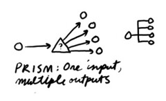 A prism is a question that divides information into smaller groups. The purpose of a prism is to break down information into categories or subgroups. An example might be “What are the parts of this system?” Prisms are used extensively in scientific inquiry. They are also used in organization design to map the departments and sub-departments of a company. An example question used in this activity might be “What roles are required to deliver this functionality?” To create a prism, define a question that can be used to divide a unit of information into its constituent parts. Alternative names: Divider, separator, splitter, brancher.
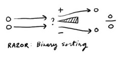 A razor is a question that divides information into two categories, based on relevance. The purpose of a razor is to define a boundary which can be used to sort any incoming information , and determine whether it lies inside our outside the boundary. A simple example: “Is this information relevant to me right now?” Productivity expert David Allen uses razors such as “Is it actionable?” as a method to process inbox information and increase productivity. A razor can also be used to sort things into rank order by asking of any two items “Which is more important?” To create a razor, define a question that can be answered only two ways, such as yes/no, or in/out. Alternative names: Cutter, fin, blade.
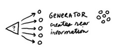 A generator is a question that has a potentially unlimited number of answers. The purpose of a generator is to explore new or unknown territory and to find knowledge that may be hidden and make it explicit. An example might be “What kinds of things are possible?” Open questions are used by inventors to stimulate discovery, for example: “How might we transport sound over great distances?” To create a generator, define a question that has an unlimited set of possible answers. Alternative names: Spout, spring, opener.
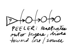 A peeler is a single question that, when repeated, drives attention to deeper and deeper levels, like the peeling of an onion. The purpose of a peeler is to penetrate beyond superficial levels in order to get to the heart of the matter. An example might be “Why?” Taiichi Ono, the designer of Toyota’s production system, described “Five whys” as the basis of Toyota’s approach, because by the time you have asked why five times, the nature of the problem as well as its solution becomes clear. But a peeler does not have to use the word “why.” Another peeler results from using the question “How does that work?” This approach has served science for many years and has led to deeper and deeper levels of the onion, from atoms to particles and beyond [Is it fair to call this reductionism?]. To create a peeler, define a single question that can be asked repeatedly to drive to deeper and deeper levels of an issue. Alternative names: Ladder, drill, hammer, spike, repeater.
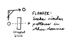 A flanker is a question that seeks patterns or ideas that are similar. The purpose of a flanker is to think laterally and find an analogous situation that may help you think about things differently. An example might be “How might you approach this problem if you were a chef?” Flankers are used to break out of existing thought patterns that may cause blind spots. To create a flanker, define a question that approaches your situation from an oblique or unexpected angle. Flanker may be a subcategory of generator. Alternative names: Similator, Analogizer, slider, sider, shifter, sidestepper, lateral.
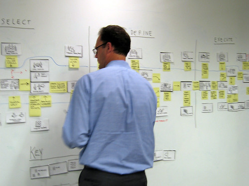
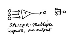 A splicer is a question that combines information, or sets, into groups. The purpose of a splicer is to find larger categories and simplify collections of information. An example might be “What do these things have in common?” Splicers are used to classify information and build hierarchical information structures. For example, any invertebrate animal that has four pairs of legs, no antennae and no wings may be considered as a members of a single class which we call arachnids. Splicers are also used in a process called affinity mapping, a process designed to find similarities in large groups of information. Another example might be “What things feel like they belong together?” To create a splicer, define a question that can be used to find commonality. Alternative names: Merger, on-ramp, combiner, fuser.