Is PowerPoint good or evil?

PowerPoint. People either love it or hate it. There is no doubt that Powerpoint has had an influence on the world — but is it a positive one or a negative one? And who decides?

Here’s what the experts say:

The case for evil:
Edward Tufte, information design expert and author of several books on the subject, recently wrote an article excoriating PowerPoint in Wired magazine, entitled PowerPoint is Evil. In it, Tufte compared PowerPoint to tools of propaganda and control:

“PowerPoint’s pushy style seeks to set up a speaker’s dominance over the audience. The speaker, after all, is making power points with bullets to followers. Could any metaphor be worse? Voicemail menu systems? Billboards? Television? Stalin?”

He goes on to make the argument that statistical data should be presented in one slide as opposed to several:

“When information is stacked in time, it is difficult to understand context and evaluate relationships. Visual reasoning usually works more effectively when relevant information is shown side by side. Often, the more intense the detail, the greater the clarity and understanding. This is especially so for statistical data, where the fundamental analytical act is to make comparisons.”

The case for good:
Donald A. Norman, former Apple Fellow and author of The Design of Everyday Things, responds in defense of PowerPoint:

“Tufte is a statistician and I suspect that for him, nothing could be more delightful than a graph or chart which can capture the interest for hours, where each new perusal yields even more information. I agree that this is a marvelous outcome, but primarily for readers, for people sitting in comfortable chairs, with good light and perhaps a writing pad. For people with a lot of time to spend, to think, to ponder. This is not what happens within a talk. Present a rich and complex slide and the viewer is lost. By the time they have figured out the slide, the speaker is off on some other topic.”

PowerPoint, true to its name, is a powerful tool. It can be used for good or evil and it can certainly be misused. Abuse of the tool is so common that it has become synonymous with the tool itself: Peter Norvig’s excellent satire, The Gettysburg Address as a PowerPoint Presentation, makes the case especially well.

But who’s to blame?
Should we condemn the tool because people misuse it? We can’t in good conscience blame the tool or the well-intentioned people who try to use it. They are simply following the guidelines, templates and wizards within PowerPoint.

“Wait a second!” you say. If PowerPoint is neither good nor evil, and the people who use it have good intentions and are trying their best, why are there so many terrible PowerPoints out there? Who’s fault is it?

It’s the wizards.

The wizards and templates within PowerPoint lead us astray. PowerPoint is a visual tool, yet the default setup is text with bullet points. Most of the “design” templates are cluttered or badly designed. The content wizards serve up bland, bullet-point-ridden generic outlines and seem to “autochoose” the ugliest design templates available.

They coach us towards bullet points, chartjunk, “meeting by template” and a thousand other “deaths by PowerPoint.” Microsoft makes great tools but when they try to deliver content they seem to fail. A more successful strategy seems to be partnering with content providers as they did with MSNBC.

Wizards, like consultants, come in all flavors, and the ones that dwell in PowerPoint are particularly capricious and not to be trusted. Follow their advice at your peril.

From presentations to conversations

Conversation
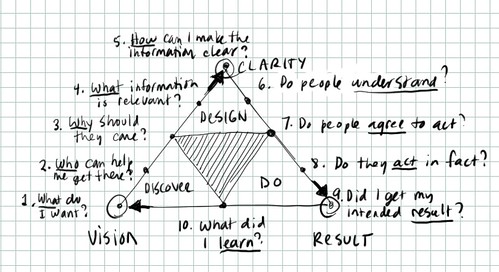
Presentations need an overhaul. I don’t mean your PowerPoint or your presentation style; I mean our cultural approach to presenting. We need to take another look at it.

Question: What is the purpose of the presentation?

The overt purpose is to educate and inform

The covert purpose is to reinforce the status of the expert and remind the audience that they are not competent to solve their own problems.

I submit that in the information age the traditional presentation model needs to change from

presenter>audience to

host<>guests.

Ideas don’t evolve in a vacuum and they don’t generally flow in one direction.

Our current paradigm is based on a preacher model. An authority figure stands at the front of the room and lectures the class for forty minutes and then takes questions from the audience. Presentation styles vary but more or less they all follow this model.

Nearly every one of XPLANE’s customers already has the expertise they need to solve their problems. They don’t need more experts in the traditional sense — they need people who can help them find, develop and share the best practices and experts within their own organizations. They don’t need more wizards and consultants; they need to improve their communication flows.

We need fewer presentations and more conversations.

We need to develop new approaches that allow the group to take on a greater role in the knowledge-sharing experience. Approaches that turn the traditional presenter into the host of a knowledge-sharing event, rather than an expert spouting wisdom.

Comedian, speaker and performing artist Heather Gold provides a great comparison of presentations vs. conversations in pdf form, which you can find here.

At XPLANE, we are working on some experiments in conversation, in an attempt to flesh out some new mechanisms for unleashing the knowledge and creativity of groups. We have already identified some interesting patterns and structures that have lead to powerful results. If your organization would like to host one, please let me know and we can try to design one together.

Please let me know your thoughts.

What’s next in visual communication?

This article was originally published in Infonomia, a Spanish magazine. Read it in Spanish here.

Two million years ago, the first distinct and recognizably human cultures emerged. These early humans – known as Homo Erectus, or upright man – made and used complex tools, formed societies, migrated over long distances, used fire, and cooked food – and they did all that without words.

These early humans had 80% of the brain capacity of modern humans, and yet they were biologically incapable of speech. They communicated with each other visually, through gestures, observation and mimicry.

It wasn’t until much later – 25,000 years ago – that the first evidence of advanced drawing and painting skills appears, in cave paintings, such as the beautiful and famous examples at Altamira in northern Spain.

Then, 6,000 years ago, writing appears. Paper was invented by an administrator (anyone surprised by that?) about 4,000 years later.

The combination of writing and paper made it possible to share complex information over long distances. For example, explorers could make and share maps, sketches and detailed records of their discoveries.

In 1440 the publishing industry was born when Johannes Gutenberg invented the printing press. For the first time, written works could be mass-produced. Books became cheaply available.

With the printing press, words were much easier to reproduce than images: roughly 100 alphanumeric characters can convey nearly any idea, whereas every visual image must be uniquely created. There were other restrictions as well: words must be carefully set in lines and columns. Occasionally images could be inset to illustrate the text but all had to be carefully positioned according to a grid.

The printing press gave birth to a powerful industry. Monarchies crumbled as the voice of the people, through pamphlets and tracts, could now compete with the voices of priests, kings and queens. The industrial age of publishing reached its peak with the massive, global entertainment industry in the late 20th century.

Today, entertainment giants such as Fox, Viacom, Disney and Sony dominate global culture because they control most of what the world sees and hears. This in turn gives them tremendous influence over what the world thinks and feels. But their days are numbered, and they know it. In the 21st century, and communication has entered a digital age. Publishing power, like computing power, gets cheaper and cheaper all the time. Eventually, both computing and publishing power will be as cheap and plentiful as paper is today.

It started in 1984, when Apple introduced the Macintosh computer and the first graphical user interface (GUI). For the first time, ordinary people could interact with a computer visually: with window, icons, folders, trash bins. People who had never considered themselves “computer people” now had access to a powerful tool for creative endeavors, which allowed them to do things they could never have done before.

Individuals could now become publishers. With very little investment they could design their own business cards, brochures, logos, even magazines. It was called desktop publishing, and professional publishers were horrified.

The world will never be the same, they said. Without professional training, people will abuse this power. And they were right. Bad design proliferated. Badly designed logos, badly designed brochures, badly designed newsletters, badly designed magazines, became the norm, when once they had been the exception.

Publishing involves both the creation and delivery of information. The desktop publishing revolution solved the creation problem, but in 1984, to deliver a magazine you still needed to print it and mail it, and to deliver a video you needed to broadcast it. And those things were expensive.

But in 1991, Tim Berners-Lee invented another revolution in visual communication: the web browser. Today, because of the web browser, you can publish your ideas to the world for the price of an internet connection.

The cost of creating and publishing information is plummeting inexorably towards zero.
The publishing industry has counted on people’s laziness, their willingness to be led, and their willingness to be fed information. This is the same mistake that established authorities have made since the beginning of time.

They fail to realize a critical fact: the ability to play with tools drives literacy, and the more literate people are, the more involved they become.

Children play with paper and pencils in order to learn how to draw and spell. And as people played with their computers they began to develop their visual communication skills. And playing with digital communication tools like the internet drives visual literacy.

Today, we are free once more. Paradoxically, now that everything has been reduced to zeros and ones, our only limit is our imagination. What’s interesting is that we continue to constrain ourselves to the grid, even when it is no longer necessary. The conventions of printing, which once liberated ideas by making them mass-producible, have now become a prison.

So what’s next? Watch the kids. In the 1970s we started playing video games, and although we didn’t know it at the time, we were learning how to interact with digital technologies. We were learning the hand-eye coordination skills we would need to operate the computers of the 1980s.
The toys of today are the tools of tomorrow: blogging, podcasting, photosharing, videoblogging – these are all early indicators. People are making their own movies and publishing their ideas to the world. With every passing year the technology gets cheaper and easier to use.

What we are seeing today on the internet is the emergence of a truly global culture, a culture that communicates visually. People around the world are playing with visual thinking toys, and their visual literacy is slowly rising.

We’re in the process of learning how to communicate visually – we’re witnessing the emergence of a global visual language. I am very happy to be a part of it.

Seven C’s of communication design

Do you design your communications or do they just kind of happen? When your communication is important — that is, when you want it to be remembered — you need to think carefully and design it to resonate with your intended audience.

Designing your communication is an iterative process. It begins at a high level, with good questions and good listening; and ends in details; constructing a presentation, document, system or user experience.

You can improve your communication by thinking about seven “C’s” of communication design: The seven C’s lay out a simple sequence which can help you start broadly and work your way down to specifics.

Here are the seven C’s, in order:

1. Context.
What’s going on? Do you understand the situation? Is there a dead elephant in the middle of the room that you’re not aware of? Ask good questions. You’ll need a clear goal before you begin to design any communication. Ask: who are you talking to and what do you want them to do?

2. Content.
Based on your goal, define a single question that your communication is designed to answer. This is the best possible measure of communication effectiveness. What do you want your audience to walk away with and remember? Once you have defined your prime question, set out to answer it. What information is required? Do you have the answer already, or do you need to search it out?

3. Components.
Before you build anything, break down your content into basic “building blocks” of content. Formulate the information into clusters and groups. What patterns emerge? How can you make the information more modular? Given your goal, what is the most fundamental unit of information? You can use index cards to break down information into modules.

4. Cuts.
This is one of the hardest parts of the process and most often neglected. People’s attention will quickly drift — they expect you to get to the point. Learn to edit. Kill your little darlings.

5. Composition.
Now it’s time to design the way you will tell your story. Think in terms of both written and visual composition. When writing; who are your main characters? How will you set up the scene? What are the goals and conflicts that will develop? How will the story reach resolution? In visual terms; where will the reader begin? How will you lead the eye around the page? In all your compositional thinking; how will you engage your audience? How will you keep them engaged? Writing it down forces you to think it through.

6. Contrast.
What are the differences that matter? Use contrast to highlight them: Big vs. little; rough vs. smooth; black vs. white. When making any point, ask, “in comparison with what?” Contrast is a trigger to the brain that says “pay attention!”

7. Consistency.
Unless you’re highlighting differences, keep things like color, fonts, spacing and type sizes consistent to avoid distracting people. Research shows that any extraneous information will detract from people’s ability to assimilate and learn.

The rule of thirds

The rule of thirds
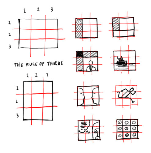
The rule of thirds is a principle of composition that helps you keep your images dynamic.

It gives you eight elements to work with — four lines and four intersections. Placing points of interest along the lines or at the intersections tends to create a more interesting composition.

3D: A model for learning and improvement

All learning and improvement begins with action — with doing. For example, as a child you touch a hot stove.

Action leads to discovery; in this case, the discovery that the action led to pain, burning, discomfort.

Based on this discovery you design new ways of interacting with your environment.

Based on your design you do things differently. Over time this leads you closer and closer to your ideal relationship with your surroundings.

The entire process is called successive approximation.

Successive approximation is the secret sauce that makes methods like agile programming work so well.

It’s the same process that is at work when you have a conversation.

You say (do) something, and then, based on the feedback you receive (body language, facial expression, reply) you discover something, based on which you design your next utterance, etc.

Successive approximation works because, unlike many business thinking, planning and execution activities, it’s easy and natural; we do it instinctively.

3d model

Lines of communication

In war, the first thing an army will attack is the enemy’s lines of communication. Why? Because success depends on people, who can only act on information they have received and understood.

The Internet was originally developed to enable rapid and reliable communication in times of war. Ironically, the resulting improvements in information flow have also spawned a fog of confusion. The volume of information that’s now available leaves many people overwhelmed, stressed and confused.

Advances in technology and genetics continue to change the business landscape in dramatic ways. There will be winners and losers, and businesses who can rapidly deploy understanding to their extended value chain — both inside and outside their “four walls” — will win.

Download Lines of Communication, a visual map of the complex information flows within a typical large enterprise, courtesy of your friends at XPLANE.